Acknowledgement
These notes are based on the slides provided by the professor, Micheal
Goudreault, for the class "CSCI-2100 Workplace Communication". I am taking/took
this class in Fall 2023-2024 semester. If there are corrections or issues with
the notes, please use the contact page to let me know. A lot of the words are
either directly taken from the slides or have been paraphrased slightly. Most of
the images in the notes are also taken from the slides provided by the
professor.
Communicates Principles (First Principles)
- Make it for the receiver.
- Get attention, keep attention, earn attention.
- Remove the "noise".
Make it for the receiver
Tailor the content to the receiver.
Get attention, Keep attention, Earn attention
Get Attention: Interesting enough that makes the reader/listener want to know
more. Connect with the audience in some way.
Keep Attention: How can you make them continue listening? Don't get to a
position where you lose attention. Connect your experience to their needs.
Earn Attention: It's about making sure that the next time they trust what you're
going to say. Provide examples, form future connection.
Remove the Noise
Noise is anything that is going to prevent the receiver from understand the
message. This could be actual noise such as a loud horn or something like a hard
to understand sentence. The noise could be coming from multiple places such as:
the sender, the channel, the receiver.
Theory
Communication Models
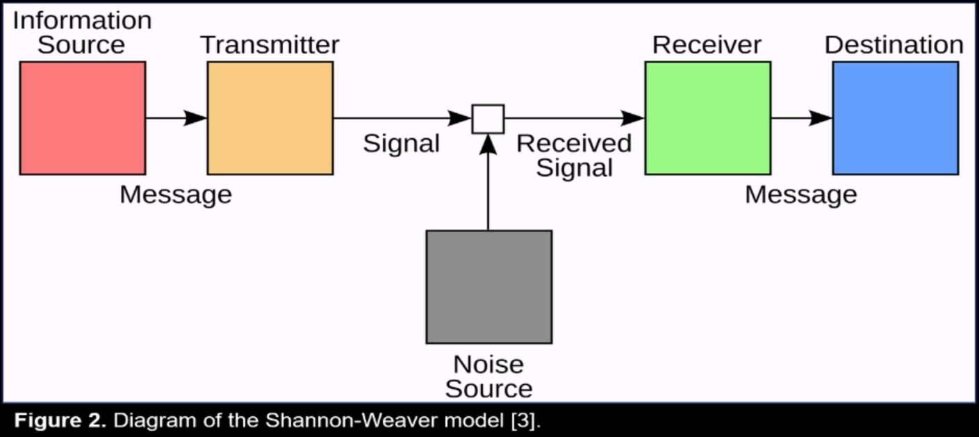
Shannon-Weaver Model (1949)
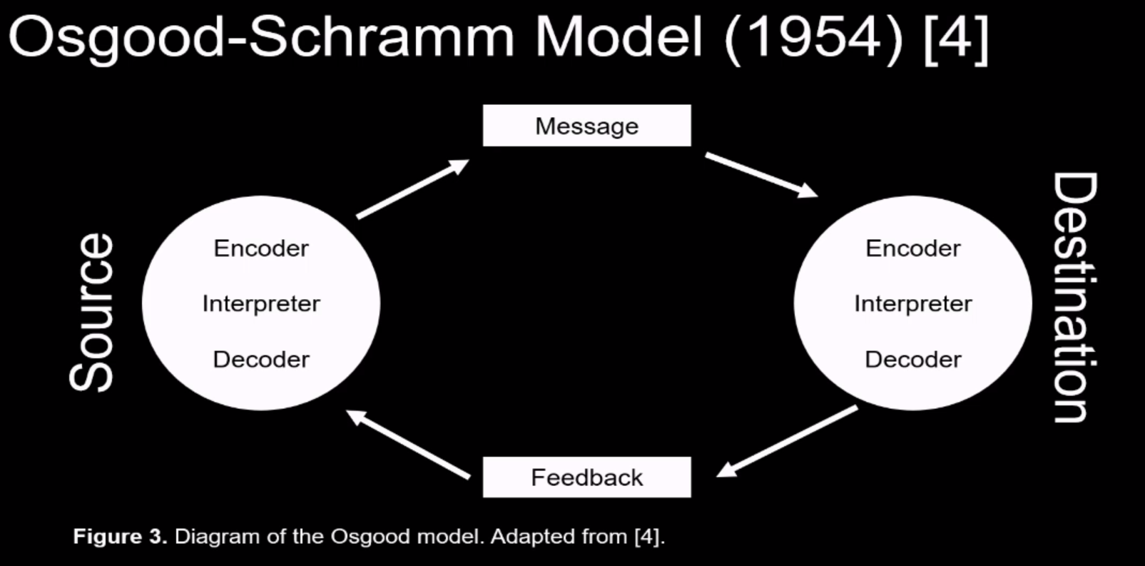
Osgood-Schramm Model (1954)
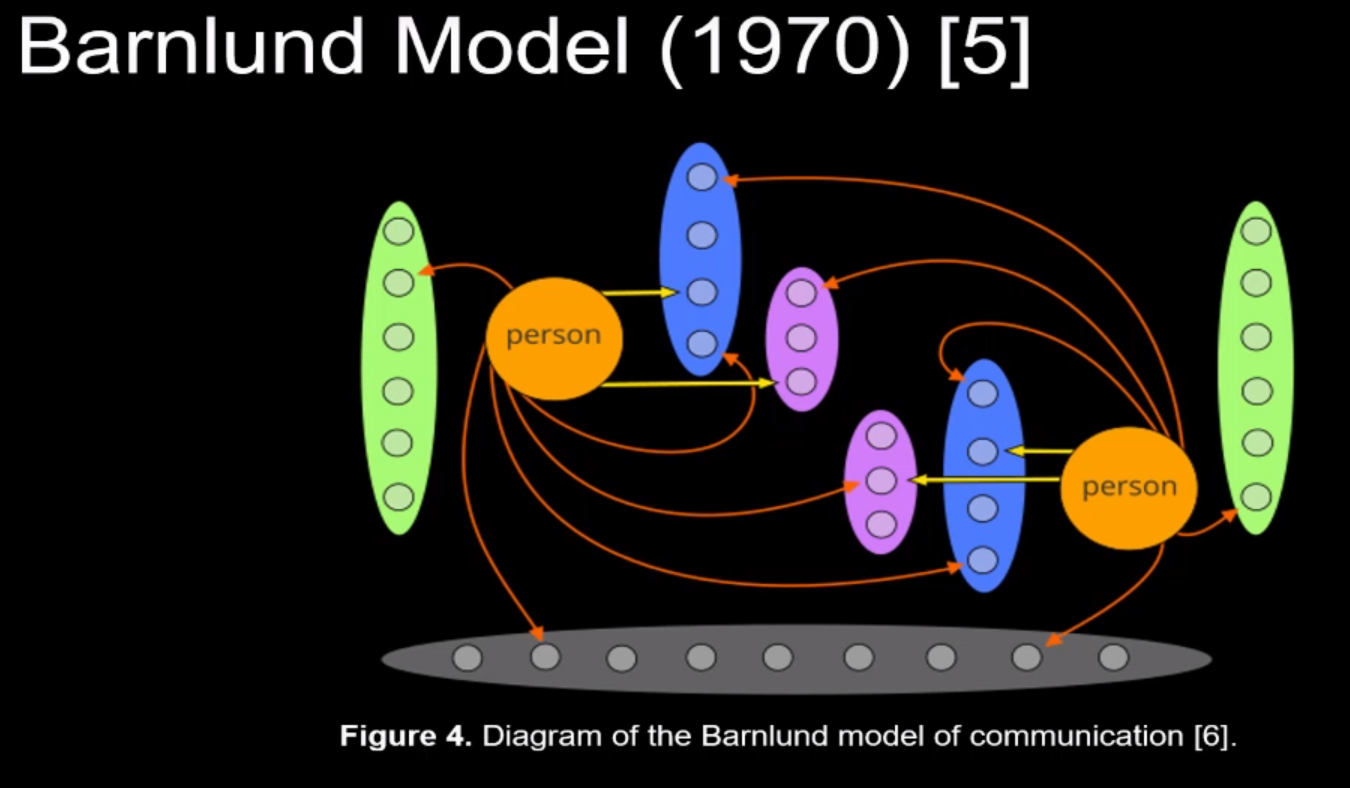
Barnlund Model (1970)
Point Of Models
There are a few key parts to communications:
- Sender: The person sending the information.
- Receiver: The person receiving the information.
- Noise: Anything that's going to get in the way of the message being understood
by the receiver.
- Context: What's going on around, how you're presenting yourself, etc.
Communication Life-cycle
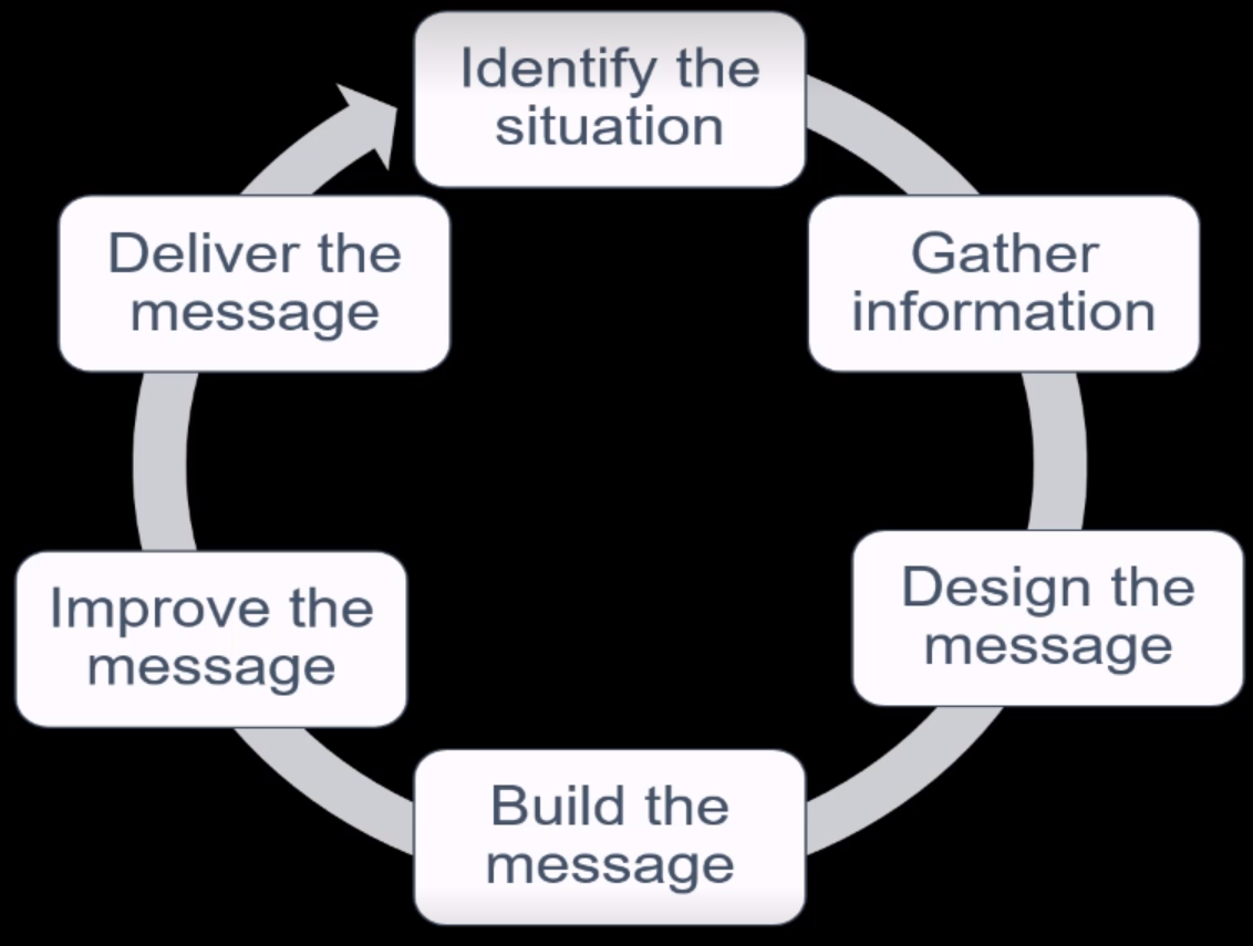
Example: Your manager has asked you to confirm the hardware requirements for a
new project.
- Identify the situation: You're required to communicate hardware requirements.
- Gather information: Figure out the specific details of the hardware the are to
be sent.
- Design a message: If it needs to be more formal, structure and design it.
- Build the message: Build the actual content of the message.
- Improve the message: Review the content and structure and make changes if
necessary.
- Deliver the message: Press send on that email or form.
This applies to any communication. You will go through the cycle even if you
don't explicitly think about it.
If the steps are skipped, then the communication may not be as effective as
necessary. Maybe it's missing some information or details that were required.
Maybe the context is missing, etc.
The Knowledge Paradox
"It's hard to remember what it was like not knowing something". When
communicating it's importing to identify the knowledge that the receiver has.
Does the person understand everything I'm saying? Are there words that may not
be clear to this audience which I'm just implicitly assuming that everyone
would know?
If possible, you can figure out what they know by analysing the feedback your
getting from them and modifying the content to "make it for the receiver."
Technical English
Main focus of technical English:
- Precise: As clear as possible.
- Unambiguous: Can only interpret this one way (single meaning).
- Transactional: It's a two way, you're working with feedback.
- Designed: Planned with intention and critical thinking.
- Tailored for audience: Focus on whoever is going to receive it. Tailor the
language for that.
Goals
The professor refers to the textbook for these points during the lecture.
- Tell a story
- Make things quick
- Keep it short
- Remove confusing words
- Make it inclusive
Tell a story: Characters and actions are to be communicated using active
voice. This keeps the sentence simple and easy to read.
Example: "The report was submitted yesterday by me" should rather be "I
submitted the report yesterday."
Make things quick: The information should be communicates as quickly and
easily as possible. The person may be very busy and if you're not keeping things
easy and short, you may not retail their attention.
Keep it short: Short words, short sentences, facts. "Advice" to "tell",
"beneficial" to "useful", etc. Sentences should be at most 20-25 words. Avoid
Jargon if possible, including acronyms.
Make it inclusive: A Self-descriptive goal, try and be inclusive in your
writing by avoiding things like "Dear Mr. XYZ" if you're unsure of the gender or
pronouns used by them. "Firefighter" would better than "Fireman".
Technical Paragraphs
- Short
- Direct
- Simple
- Clear
Suggestions:
- Have a topic sentence the describes the content of the paragraph.
- Make it cohesive by using things like transition words such as "in addition",
"therefore", etc.
- Stick to facts. Most written work is permanent, you're keeping the content
factual.
STE (Simplified Technical English)
It's a controlled language for use in technical documentation. This is for
purposes where the communication of critical information such as Aerospace and
Defence industry. ASD-STR100 is the one written for the Aerospace and defence
industry. STEs are designed for technical writing and effective communication.
It has writing rules and a controlled dictionary.
Public Speaking
- One narrow topic.
- Make it relevant to your audience.
- Use familiar concepts (with respect to the audience).
- Make it benefit the listener.
Suggestions:
-
Help the audience: They are interested in your topic, help them understand it.
-
Focus on the present: If something goes wrong, focus on what you going to do
now. Adapt to the situation.
-
Don't Apologize: If something goes wrong, don't apologize for it. It draw
attention to the issue.
-
Find your own path: Understand how you present and practice the presentation.
-
Own the silence: Don't use filler words such as "um" or "so". Silence is
powerful and you can pause when you're trying to think of the next word.
-
Don't focus on your gestures: Have natural gestures don't have "loud" gestures
which draw away from the presentation.
-
Have a confident posture: it helps with your confidence and the delivery of
the presentation.
Openings
Think about what would grab the attention of the audience. How can I create
interest in this topic I'm going to be talking about.
- Pose a question.
- Tell a story.
- Show and tell.
- Create a connection.
Dull openings:
- Today I will talk about...
- It's nice to be here...
- My topic today is...
It's better to jump into the topic itself, it's more interesting.
Closing
- Call to action.
- Reiterate.
- Challenge.
- Quote.
Dull closings:
- So yeah.
- That's it.
- I'm done.
Structure
- Beginning: Get attention.
- Middle: Keep attention.
- End: Earn attention.
Create a spark, challenge (something they can think about the topic),
resolution (something they can end with).
Through the presentation we add ways for the audience to link back together
everything that's been said.
Remembering
When it comes to trying to remember the content of the presentation, there are a
few options.
- Reading: often boring and unnatural.
- Memorization: Unnatural, very easy to lose your place.
- Wing it: Casual, often hard to follow, requires thinking time.
- Cues: Keep a few points in mind. Reminds you if lost. Feels more natural.
Collaboration
NOTE: The collaboration lecture ( Lecture 5 ) has a lot of content that I've
personally deemed redundant or unnecessary which I've not included in the notes.
If you're trying to get EVERYTHING about this lecture, please use a different
source.
Google's Team Effectiveness Research
Google studied 180 teams across the organization with multiple perspectives.
Features of good team:
-
Psychological Safety: Members feel comfortable to share ideas.
-
Dependability: Members need to be able to rely on each other.
-
Structure And Clartiy: Why does the team exist? Who are we reporting to?
-
Meaning: What is the goal of the team? What are we working towards?
-
Impact: How are my contribution helping the team?
What didn't matter:
- Co-location: Working in-person and living close by.
- Consensus: Having everyone agree on the same thing.
- Extroversion
- Individual perform
- Workload size
- Seniority
- Team size
- Tenure
Dealing with Disagreements
Good teams disagree with ideas. Bad teams disagree with each other.
Avoiding Interpersonal Conflicts
- Do research, debate with facts.
- Find alternatives.
- Agreed-upon goals.
- Humour.
- Balanced power structure.
- Don't force consensus.
Challenges of Complacency
Groupthink is when the group knows each other too well and there is no more
conflict of ideas or valuable debates.
Correspondence
NOTE: The corresponding lecture ( Lecture 6 ) has a lot of content that I've
personally deemed redundant or unnecessary which I've not included in the notes.
If you're trying to get EVERYTHING about this lecture, please use a different
source.
CRUST
Principles for Communication:
- Contextualized: Context of what you're trying to say.
- Relevant: Why should they care? How does it affect them?
- Unambigious: There should be only one way this can be interpreted.
- Simple: Is it the simplest way to explain to your audience?
- Trustworthy: Why should they believe you? Fact-check content.
Emails
- Permanent record.
- Formal business document.
- Needs to be accurate and well written.
- Do unto other.
- Select your recipients.
- Give time to emails.
- Don't overemphasise.
- Don't omit the email thread.
- Don't use recall requests (don't try to delete emails).
- Use a descriptive subject line.
- Never reply to spam.
- Don't forward jokes, cat pictures, etc.
Reports
Reports are created for a couple of reasons such as:
- Assist in decision making.
- Collect and organise facts.
- Form a permanent record.
Types of Reports:
- Document: Inspection, assessment, trip, incident.
- Progress: Occasional, periodic, milestones.
- Recommend: Proposal, recommendation, feasibility.
Very few people read the entire report.
Structure
- Summary: What is the report about?
- Context: Why is this report being written?
- Details: The facts and the content of the report.
- Next Steps: Conclusions, recommendations, etc.
Formal reports are usually longer than 10 pages and are outward facing. They are
written to summarize the operations or discuss the overall events.
- Letter of transmittal
- Title page
- Summary
- Table of Contents
- List of tables and figures
- Introductions
- Discussion
- Conclusion
- Recommendations
- Glossary
- References
- Appendices
Informal reports are usually shorter than 10 pages and are usually internally.
They are for written proposals or recommendations. They cover more
specific/smaller topics.
- Summary
- Context
- Details
- Conclusions
- Recommendations
Design
CRAP
Principles for design:
- Contrast
- Repetition
- Alignment
- Proximity
Writing Without Words
Information must be clearly formatted, well organized, and skimmable. Most
people don't have time to read every sentence.
Heading
Using effective headings is one of the easiest way to organise information.
Headings must have:
- Difference in size
- Indentation (optional)
- Levels
Lists
There are several key points required for a list:
- 2-8 items in a list
- Lists should stand out
- Introduction sentence
- Parallel phrasing
There are multiple types of lists:
- Bulleted lists: If order doesn't matter
- Numbered lists: Only if order matters
- In-sentence lists
- Labelled lists
- Nested lists.
Punctuation: The prof recommends that the last element of the list get the
period as shown in the above list. If each of the points are complete sentences
then each sentence gets a period.
Parallelism
Lists and heading should all follow the same patterns. This would include things
like using questions, words, sentences in the points. They need to be
consistent.
Good Example:
You must take out
- the garbage
- the recycling
- the compost.
Bad Example:
You must
- take out the garbage
- recycle
- composting is good.
IEEE Referencing
There are a list of tips for IEEE referencing, they are in no particular order:
-
Use something similar to [1, p.93] when citing a particular quote. If it's
an online resource, then count the paragraph it's on.
-
Use all the information provided. If you know something about the resource and
there is a format in which you can use it, then you should. Example, if a
publisher and chapter is known then you should use both of those in the
reference list.
-
If something spans multiple pages then use pp. xx-yy otherwise use p. xx.
This include inline citation and the reference list in the end.
Overview For Midterm
Here are some links to important "overarching themes". These were stated to be
so by the professor in Lecture 10.
Simplicity
Reducing Jargon
Understand the audience that you are writing/speaking for. Identify the level of
jargon that the audience will understand.
We should strive to the balance between the three aspects of our writing in
terms of simplicity:
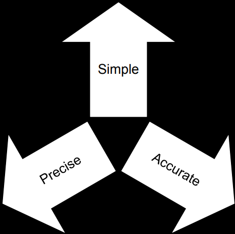
The way this balance can be achieved is by analysing the audience and the
purpose of the content being delivered.
Jargon, a shorthand between experts, has high precision and high accuracy but it
may be inaccessible to the audience.
CODS
CODS is a tool to example and simplify complex terms to an audience. It stands
for:
- Comparison
- Outcome
- Demonstration
- Stepping stones.
Comparison
We can compare something the audience already knows to the idea being presented
to allow them to draw a connection. Connecting new ideas to existing one is
known to be one of the best ways to learn something new.
Example: "A Tesla is like a normal car but does not use gasoline". It uses a
format X is similar to Y.
Outcome
What is the most important things that audience needs to understand? How can
this be communicated without having to explain all the nuances of the topic?
Identifying the outcome will help tailor the communication.
Example: If you need to tell a person a feature is not possible, they may not
need to know all the details of why this feature is not possible - just that it
is not possible.
Demonstration
Demonstrating a concept with things like demos, graphs, figures, etc help with
the explanation of the idea being communicated. It's a useful tool to simplify
the communication.
Example: If you don't know what a cat is then it's easier for me to show you a
picture of a cat and say, that's a cat rather than trying to describe all the
details of why and how something is a cat.
Stepping Stones
If you know what the audience already knows, then you can build a communication
around how you're going to talk about something. You can build each idea/concept
piece by piece.
Example: In university, there are 1000 level course which are required by 2000
level courses so that a foundation can be established become bringing out the
big-guns.
Example Of Using CODS
As this class did not cover any ornithology (the study of birds), I though I
might introduce a little bit.
The Golden Pheasant is a beautiful bird, of which there are only a few left.
It has a bright yellow crest on its head and a very colorful body. These birds
are about twice the size of a sparrow in terms of body length. However, they
have extremely long and beautiful tails. They are native to areas of western
China but have been found in multiple places around the globe. Here is an image
of this fascinating bird:

Image taken from nature-anywhere.com
Biologists use various levels of classification to categorize living creatures,
making it easier to study them. "Class" and "Order" are such levels in this
classification system. The Golden Pheasant falls under the class "Aves," which
includes all birds, and it belongs to the order "Galliformes," a group
characterized by heavy-bodied, ground-feeding birds.
I tried to use every tool from CODS in the above section on Golden Pheasants. I
hope you can identify where each tool was used.
Illustrations
Illustration are figures or tables. Anything visual that is not a table, such as
images, graphs, charts, are figures.
Illustrations help to emphasise points already mentioned in the text.
Caption
All illustrations must have captions. Captions help explain to the reader why
this illustration exists here and what its trying to explain. The caption must
also number the figure or table accordingly (Figure 1, Figure 2, Table 1, Table
2).
- Tables: Captions go on top of tables.
- Figures: Captions go under figures.
Steps for captions:
- Identify if it's a table or a figure.
- Give it a number (Table 1, Figure 1, etc).
- Give it a descriptive caption.
- Add a citation if needed.
Citation note: If something if not exactly like it was in the source
then something like "adapted from [1]" must be used to explicitly state that it
was modified.
If you found the information yourself, or if you took the image yourself
(including screenshots) - you do not have to cite it.
The words "Figure X." and "Table Y." should be in bold in to allow the reader to
easily find the mentioned figure or table.
Example of a figure with reference and a caption:
Example of a table with caption:
Anchoring
ALL illustrations must be tied down somewhere in a paragraph. That is, it must
be referenced by some text and should explain what the illustration is
illustrating.
Example: "...as shown in Figure 1, the structure of the bird is similar to
that of a sparrow. However, as Table 1 indicates, the average of these birds
are...".
The words "Figure X" and "Table Y" should be in bold in both the caption and
the anchor to allow the reader to easily find the mentioned figure or table.
Presenting Online
Something I'd like to mention before I start: I'm not sure if this is important
for the final but I think there are useful points in general.
-
Maintain proper distance: Since you appear a lot close, people notice
things a lot more. Be aware of this and keep movements closer to yourself to
keep it within the screen.
-
Choose lighting: TLDR - Have your lights in front of you rather than
behind you so that the face is illuminated properly.
-
Set camera to be eye level: Looking down or looking up at a camera is
going to make the audience feel uneasy about the situation. Make sure your
camera is at eye-level.
-
Phone camera: Don't hold it vertically - having a horizontal view is
preferred since people watching you on a laptop are going to view you
horizontally.
-
Appropriate headroom: Majority of the focus should be on you and your
face. Don't have a lot of room above or don't cut off a chunk of your head.
Ethics In Presentation
- Be truthful.
- Don't exaggerate.
- Distinguish facts and opinions.
- Acknowledge sources of information.
- Present things accurately and fairly.
- Do not omit or alter important information.
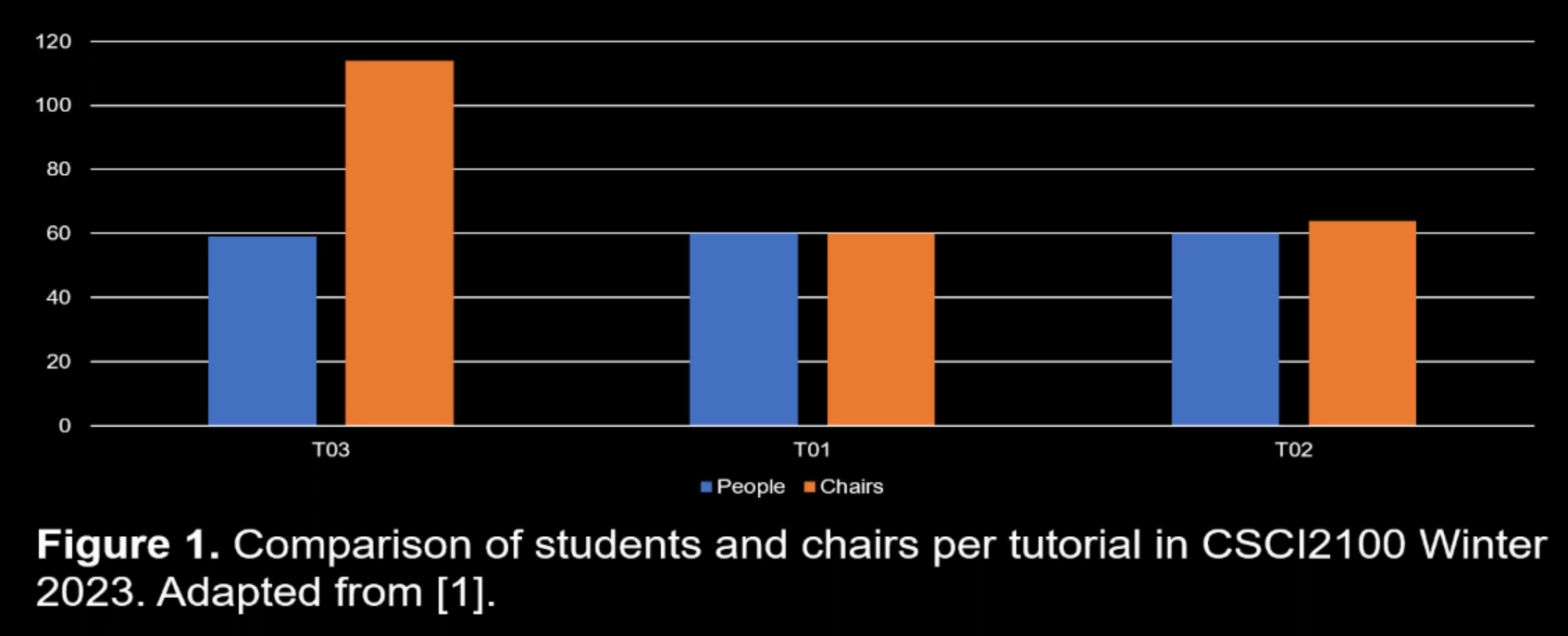
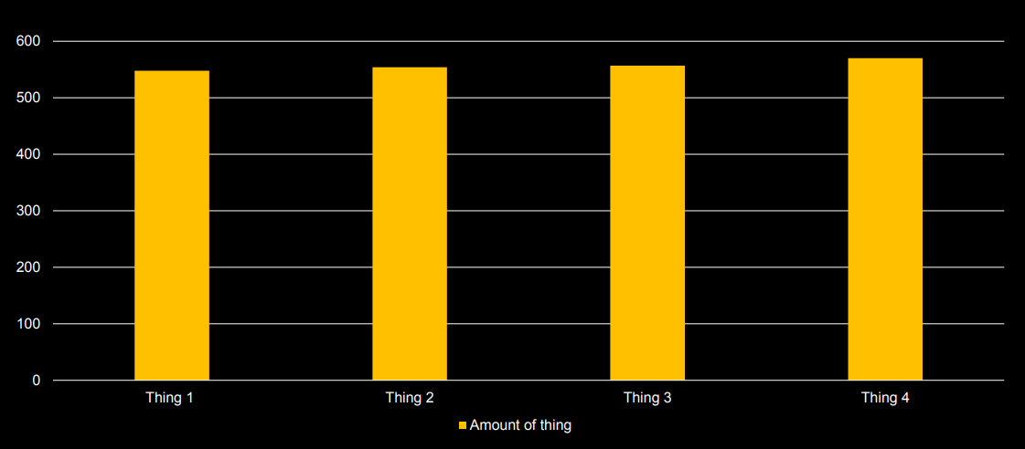
Misleading Visuals
Bar Charts Scales: A common misleading problem is caused when the creator
changes the y-axis to be either a different scale or change the start of the
scale to make things appear like a bigger difference than they are.
Example:
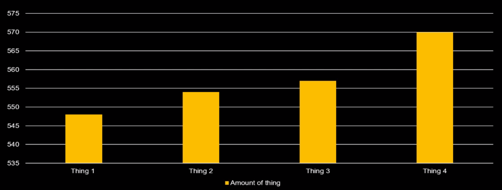
The above image makes it seem like the difference in the things is quite
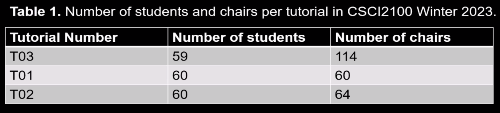
significant but if you were to actually start the Y-axis at 0, then the change
would be much less apparent. This is because in a bar graph we are looking at
the volume of the graph to judge the amount. The image below sets the Y-axis
back to 0.
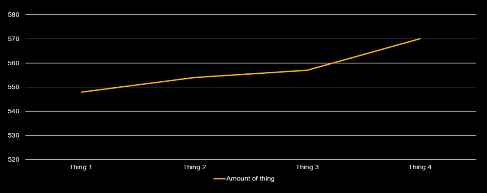
Line Graphs: When looking at a line, we tend to be looking at changes and
therefore, shifting the Y-axis may be necessary to make a point. This does not
necessarily lead to issues since we're only making the change apparent.
Example:
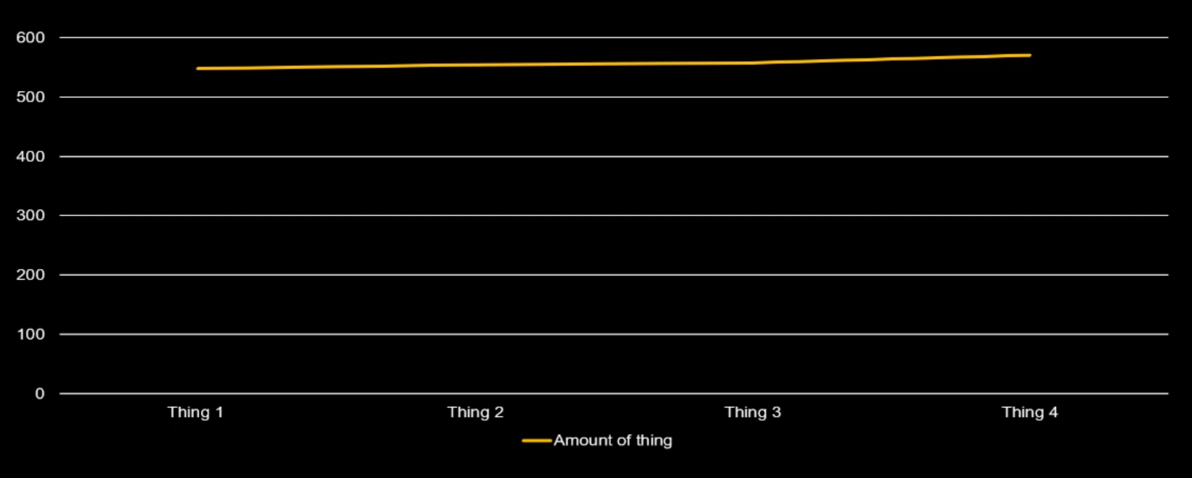
The above graph does not demonstrate the change in value well. We change shift
the Y-axis to demonstrate the change better:
Volume of image scaling: If you double the length of an image, then the
volume changes by 4 times. Therefore, making something bigger in size may be
misleading.
Example:
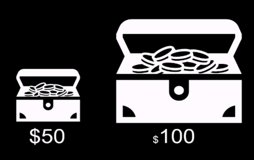
The above image scales the length by 2 but this leads to the size being scaled
by 4. This may lead the viewer to perceive the change as bigger than it really
is. Here is a more realistic example of the difference:
![mis-leading-icon-image2](/static/uploaded-data/8906d68f-e034-486b-8c38-1b359af01651.png